
What is most important on a book cover?
Unless you have an amazing title that speaks for itself, a great image speaks far faster to the consumer than a bunch of words. — Tal Goretsky, Scribner art director
Let’s explore why your book’s visual presentation is just as important as the words inside—and how a well-designed cover can become your most powerful sales tool.
Number One
Your book’s title and subtitle are the most powerful hooks to grab your audience’s attention.
Like a headline, the title needs to be instantly clear—and if possible, clever or emotionally engaging. It should spark curiosity, making readers want to know more. Whether browsing online or in a bookstore, readers often decide within seconds whether a book is worth exploring—and that decision starts with the title.
Ideally, your title should be short, punchy, and memorable—typically two to five words. Think of it as the essence of your book’s message, distilled into a single compelling phrase. A strong title sticks in the mind and rolls off the tongue, making it easy to share, search for, and remember.
The subtitle serves a different but equally important role, targeting your specific audience, giving readers a reason to care. In seven to twelve words, your clarify what the book is about and suggest the benefit or transformation the reader can expect. It’s your opportunity to position the book clearly—whether it’s a guide to spiritual growth, a roadmap for leadership, or a collection of inspirational stories. A well-crafted subtitle acts as a promise to the reader: This is for you, and here’s why it matters.
Number Two
You might be surprised with what I think might be Number Two. If you’re self-publishing or are paying a custom publisher, you get to decide. What do I think might be Number Two? Your name in big type on the front cover.
In humility, set the type size small, and readers will subconsciously think, The author isn’t important. Is that really what you want to say? If you didn’t have something important to say, should you have written the book? No could be the important the time to use big type so readers will get the hint: This writer is an unknown celebrity.
On the other hand … many of my humble clients want their names in small print because they don’t see themselves as that significant. If that’s true, then maybe it’s not needed on the cover at all. Use that precious space for something else that will sell books—like better graphics. Inside, include your name on the title page and have an “About the Author” page in the back matter. I’ve seen that done on traditionally published academic works, and it makes sense when they are a compilation of mainly other people’s work.
Number Three
The graphic design of your book cover is more than just decoration—it sets the tone, conveys the theme, and offers the first glimpse of the treasure waiting inside. A compelling cover invites readers in, promising a journey worth taking. It’s not just about looking good. It’s about connecting emotionally, visually, and thematically with your target audience.
A professional, well-thought-out design instantly communicates credibility and care, signaling that what lies within has equal quality and value.
While it may be tempting to simply use a stock or personal photo with text placed on top, that approach often falls short of professional standards. Such covers tend to look amateurish and fail to capture the imagination. A great book deserves a great first impression—one that resonates with readers’ hearts before they ever read the first word. Investing in a custom, genre-appropriate, and emotionally engaging design isn’t just an aesthetic choice. It’s a strategic choice.
Number Four
The tagline on the back cover is your book’s second chance to make a lasting impression. While the front cover is designed to attract readers’ attention visually, the back cover—especially the tagline—is where you capture their interest intellectually and emotionally. The tagline acts like a movie trailer in a single sentence—a brief but powerful statement that stirs curiosity, hints at the journey ahead, and compels the reader to read the narrative the follows.
In many ways, the tagline is your book’s half-minute pitch boiled down to one memorable line. It should echo the tone and theme of the book, whether it’s inspiring, mysterious, or suspenseful. Is it humorous? Alarming? A great tagline speaks directly to your target audience’s hopes, questions, or struggles, showing that it answers their unspoken question: Why should I care about this book?
Whether your book is fiction or nonfiction, spiritual or practical, the tagline should leave a lasting impression in just a few seconds. It’s that nudge of intrigue or encouragement that can turn browsing into buying. In a crowded marketplace, a well-written tagline could be the difference between a passing glance and a sale.
Number Five
The back cover narrative is your book’s spoken invitation—where you talk directly to the reader, offering a longer look at what’s inside. While the front cover may catch readers’ eyes, the back cover is where they decide whether to take the book home. The first sentence is crucial, to grab and hold attention with a question, bold claim, or emotionally charged idea. The last sentence should leave no doubt—this is a book worth reading.
“Short and sweet” narratives beat “long and boring” every time. Readers don’t linger on back-cover text. They glance. They scan. You have only a few seconds to connect, so every word must count. A tightly written copy communicates confidence, clarity, and value. Too much information, rambling details, or dense summaries can cause the reader to disengage.
The middle sentences carry the burden of keeping the reader hooked. Once you’ve drawn them in with a strong opening, you must show the problem your book addresses, the benefit it delivers, or the experience it offers.
End with a compelling call to action. For example, Discover the truth that could change everything, or Join the journey today, or Don’t wait. Step into an exciting story now. Your final line should stir a sense of urgency and anticipation. After all, the goal isn’t merely to inform. It’s to persuade.
Number Six
Endorsements can lend instant credibility, but they must be used strategically. A well-placed endorsement—especially on the front cover—can draw attention, establish trust, and influence a reader’s decision to buy the book. However, that front-cover real estate is incredibly valuable and should be reserved for only the most recognizable and relevant names. If your endorser is a top-tier celebrity, known by nearly everyone in your target audience, then a front-cover endorsement can shine. Even then, exercise caution. The endorsement should never overshadow the author’s name or the book’s title—or readers might ask, Should the celebrity have written the book instead? Endorsements should support the book, not eclipse it.
Back cover endorsements are best reserved for recognizable names that are relevant to the book’s theme and known by the majority of the intended audience. Because back cover space is limited and precious, endorsements featured there must be short, sharp, and powerful. One single sentence is ideal, as effective as a headline when done right.
All other endorsements belong inside the book, preferably on an “Endorsements” or “Praise for This Book” page near the front. This allows room for more thoughtful, detailed praise from supporters and niche influencers without cluttering the cover. While these names may not be widely recognized, their support still adds substance and depth for readers.
Use endorsements to amplify your message, not drown it out.
Number Seven
Including an author bio and picture on the back cover can be encouraging for the writer, but the more important question is: Will it matter to the reader? If the bio doesn’t build trust, enhance the reader’s interest, or lend credibility to the content, then it doesn’t have enough value to justify back cover space. In that case, author information is better placed inside the book.
When the author’s experience or story directly connects to the topic—it should be presented on the back cover briefly and strategically. A few well-crafted sentences and a professional, friendly photo can help readers feel a connection to the author. But less is more. The shorter and more focused the bio, the more likely it will be read. Long, detailed résumés rarely grab attention.
For those who want to share more about their background, accomplishments, or personal story, the right place is inside the book—on a dedicated “About the Author” page. This allows room to expand without competing with the back cover’s limited space and purpose.
The back cover is prime marketing real estate. Every word and image must serve the reader, not the ego. When used wisely, an author photo and bio can enhance the message. But when in doubt, simplify—and let the story or message take the spotlight.
Final Judgment
When it comes to designing your book cover, all elements must work seamlessly to grab the reader’s attention. From the title and subtitle to the graphic design, tagline, endorsements, and back cover narrative, each piece must be crafted with clarity, strategy, and reader benefit in mind.
Ultimately, your book cover is a marketing tool, a silent spokesperson, and a visual invitation into the world you’ve created inside. The best covers don’t just look good … they whisper promises, spark curiosity, and invite the reader on a journey.
So be deliberate. Be reader-focused. Be excellent. Why? Because like it or not, your book will be judged by its cover. If done well, that judgment will be a resounding yes.
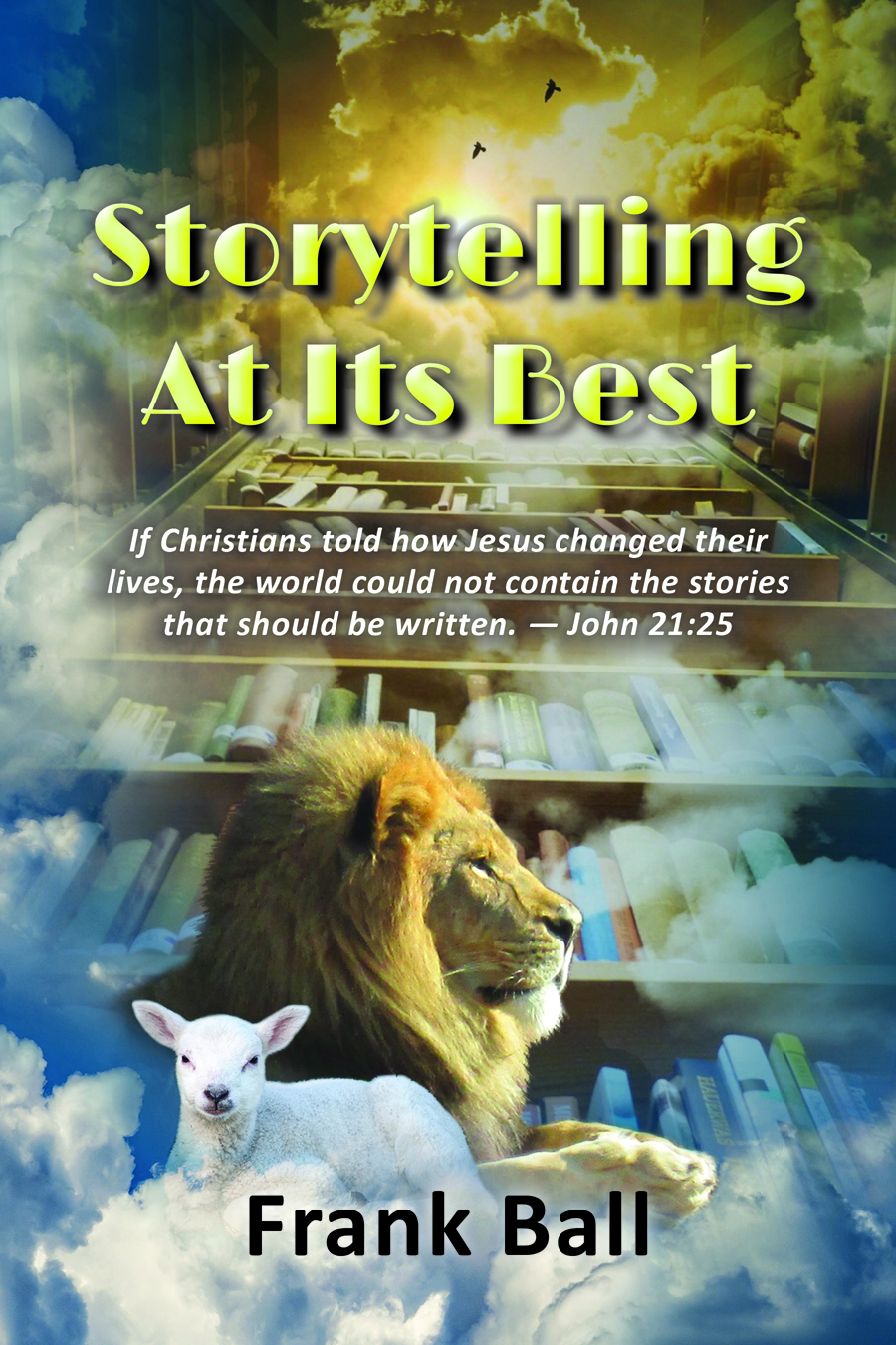
For a practical guide to storytelling, check out Storytelling at Its Best